IOS Custom Table View Cell
Reusing Table View Cell
So far, we have seen that a table view is responsible for building itself and we need to provide a very minimum setup for a table view.
- One method to say how many rows it has
- And another method to instantiate a new table view cell object, and give it some content.
func tableView(_ tableView: UITableView, numberOfRowsInSection section: Int) -> Int {
    return 20
}

func tableView(_ tableView: UITableView, cellForRowAt indexPath: IndexPath) -> UITableViewCell {
    let cell = UITableViewCell()
    cell.textLabel?.text = "This is the cell for \(indexPath.row)"
    return cell
}
We wrote these methods, but table view itself takes care of calling them.
- Now imagine we have a table view with a large amount of data, such as hundreds, or thousands of rows then table view will immediately call the following method thousand times to get all the rows with table view cell objects.
func tableView(_ tableView: UITableView, cellForRowAt indexPath: IndexPath) -> UITableViewCell
- We will only see 10-15 rows at a time on screen, all other rows will be created, but we won't see them until we scroll up/down.
- And holding them all the cells in memory seems inefficient.
- The table view has a built-in solution, instead of creating new cell object for every row, use the reusable cell which is also known as dequeuing a cell.
- W can then change the contents of the existing cell object, which is quicker and more efficient than instantiating a new table cell object.
To work with reusable cells in a table view doesn't require us to add any new methods, it's just going to be a small change to the regular table view cellForRowAt indexPath method.
func tableView(_ tableView: UITableView, cellForRowAt indexPath: IndexPath) -> UITableViewCell {
    let cell = tableView.dequeueReusableCell(withIdentifier: "simpleCell", for: indexPath)
    cell.textLabel?.text = "This is the cell for \(indexPath.row)"
    return cell
}
So instead of always instantiating a new cell, we will call tableView.dequeueReusableCell method to dequeue a reusable cell so that we can change its contents and return it.
If there isn't a reusable cell available to dequeue, this method is smart enough just to create a new cell object. This method needs two arguments;
- The first argument is an identifier, a table view can have different cell styles to allow it to present data in different ways and if we want different cell styles, we can associate a name for these different styles.
- The second argument is an indexPath parameter that's being passed to this method.
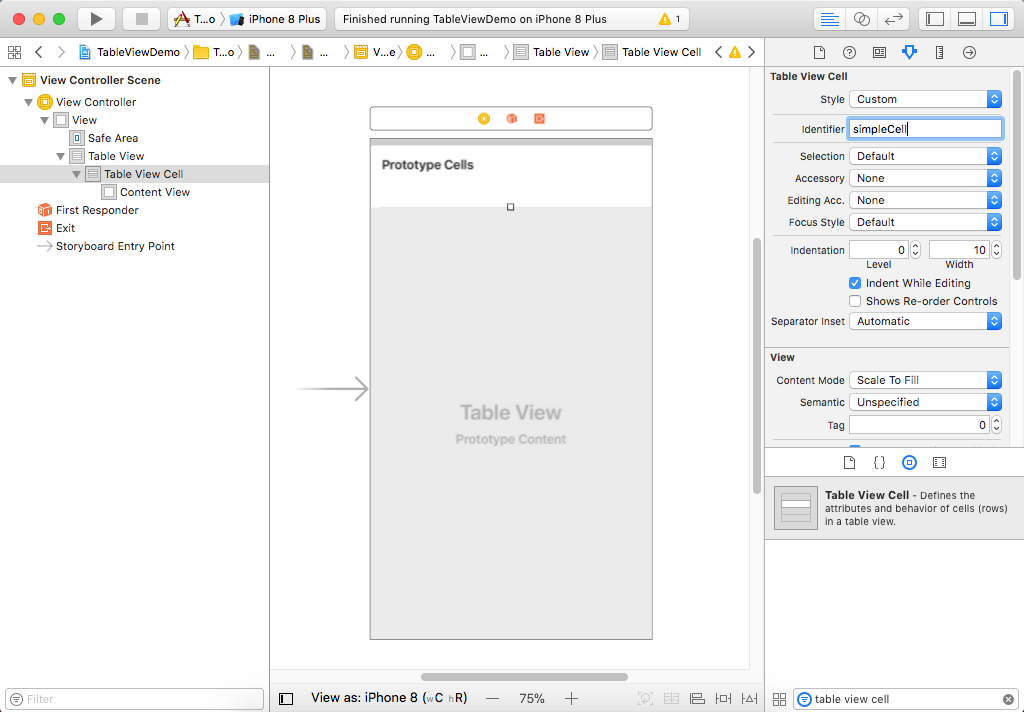
Now we need one minor thing by creating the identifier of "simpleCell" which we have passed as a first argument to the tableView.dequeueReusableCell method.
So Let's open the Main.storyboard, search for Table View Cell in Object Library and drag it to the storyboard.
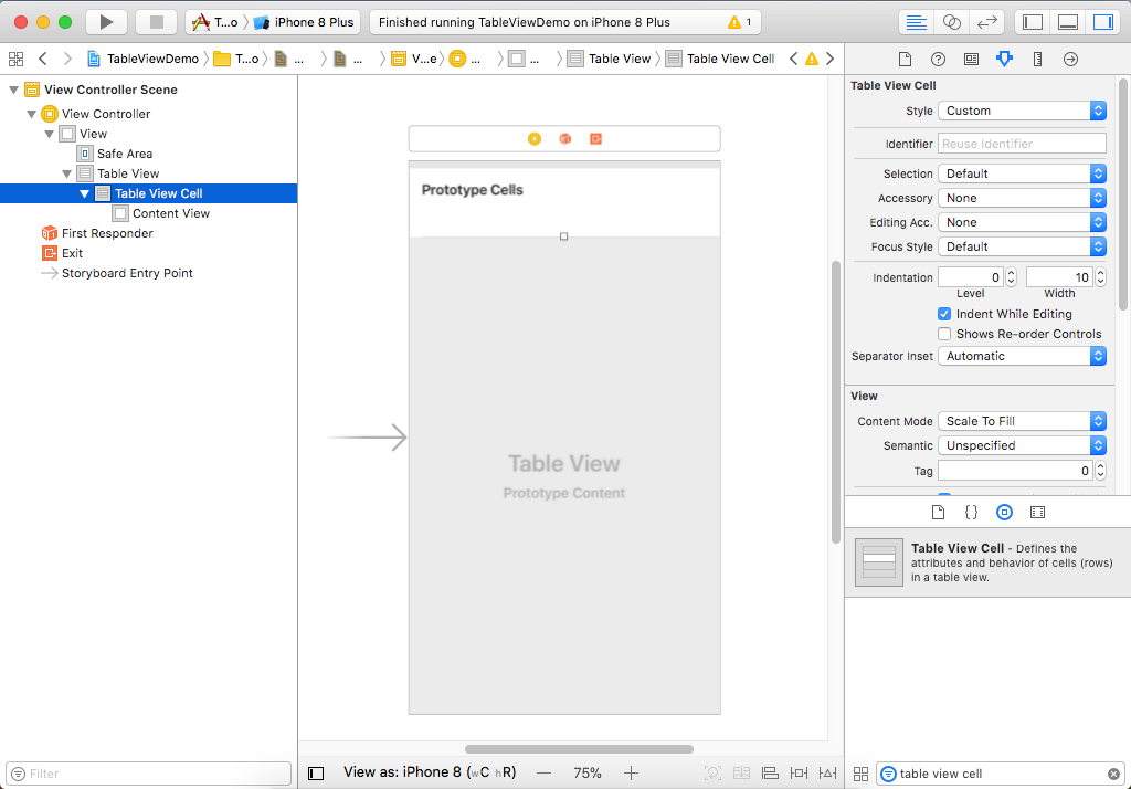
- If you look at the Document Outline, the view hierarchy should be like the basic view, within that is a Table View, and within that is a Table View Cell.
- Select the Table View Cell and open the Attribute Inspector and you will see an option for Identifier.
- Let's enter "simpleCell" in the Identifier field and make sure that this identifier matches whatever you called it in your code.
Now when you run your application, you will see the same result, but you get smoother scrolling and much more efficient use of memory.
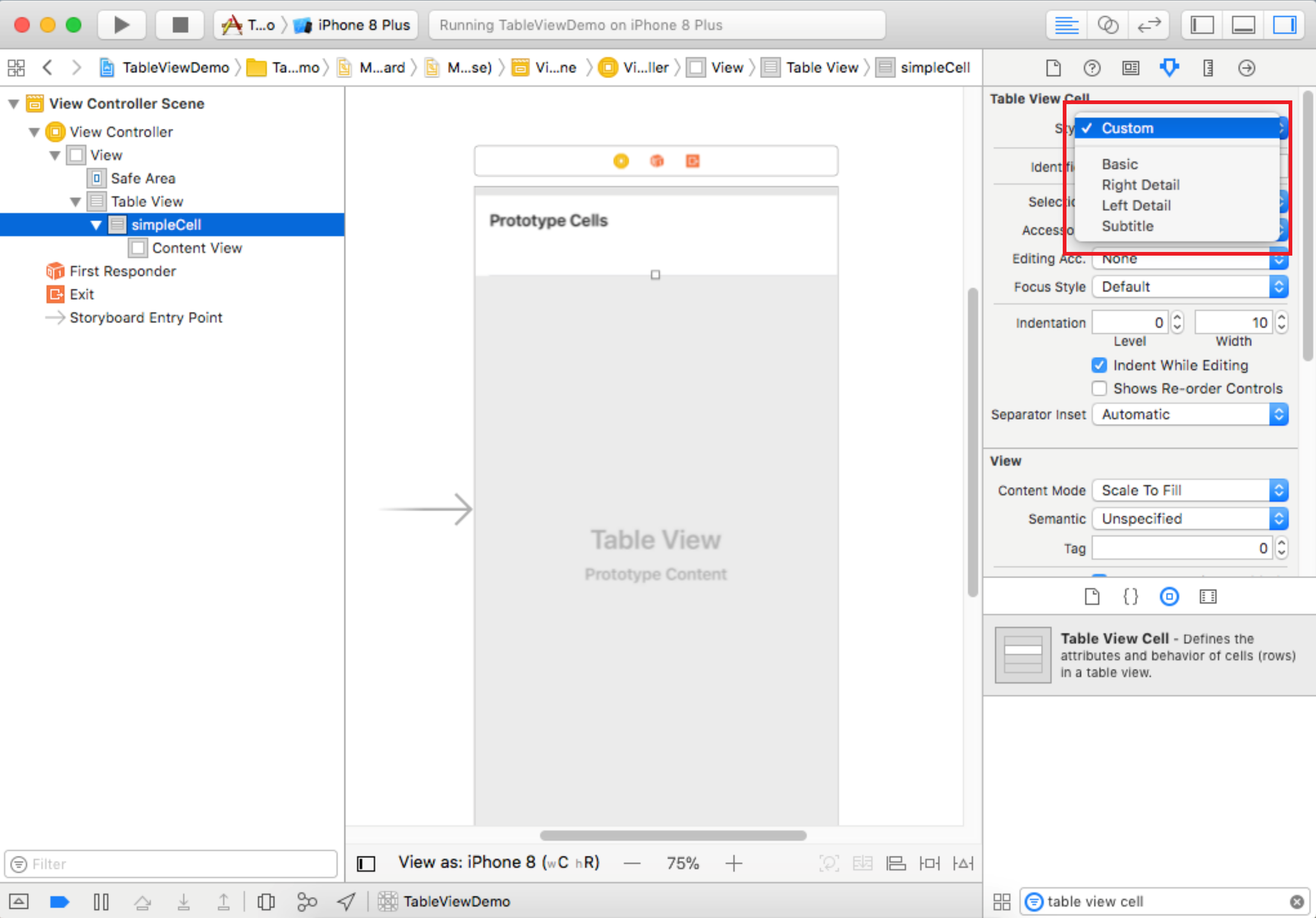
Table View Cell Styles
You can use different styling for your table view cells than just having a single line of text. There are four different built-in styles for table view cells.
- Basic
- Right Detail
- Left Detail
- Subtitle
You can define your custom cells and their contents using Xcode to design them and dragging on controls from the Object library.
textLabel
- The regular table view cell has a property called textLabel which we have used to provide some text, but it also has a property called imageView, an area on the left ready to show an image object.
imageView
- If an image is set, it appears on the left side of the cell, before any label.
- UITableViewCell creates the image-view object when you create the cell.
detailTextLabel
- It holds the detail label of the cell, UITableViewCell adds an appropriate label when you create the cell in a style that supports secondary labels.
- If the style doesn't support detail labels, nil is returned.
accessoryType
- It also has a property called accessoryType; accessory is the term we use for the small icons or glyphs on the right-hand side.
- The data type of this is an enumeration and includes the following options;
- disclosureIndicator: The gray chevron to suggest that this row leads to something else.
- detailButton: The informational circle.
- detailDisclosureButton: The combination of the first two. There's also
- checkmark: Show the check mark
- none: The default value
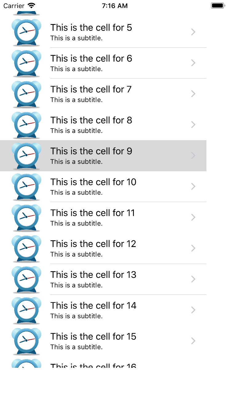
Now let's use these properties like images, detailTextLabel and accessory types on our table view cells. First, let's add some image/icon to your project in an asset catalog file by selecting the assets.xcassets file.
At the bottom of Document Outline, you will see a plus button to add a new asset to this file.
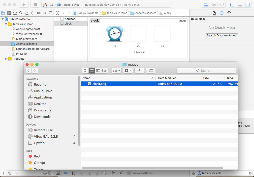
Select a New Image Set, call it a clock and drag an image you want to show in the imageView. Go back to the controller class and add the following code to add imageView, detailTextLabel, and accessoryType.
func tableView(_ tableView: UITableView, cellForRowAt indexPath: IndexPath) -> UITableViewCell {

    let cell = tableView.dequeueReusableCell(withIdentifier: "simpleCell", for: indexPath)
    cell.imageView?.image = UIImage(named: "clock")
    cell.detailTextLabel?.text = "This is a subtitle."
    cell.accessoryType = .disclosureIndicator

    cell.textLabel?.text = "This is the cell for \(indexPath.row)"
    return cell
}
Now let's run your application.